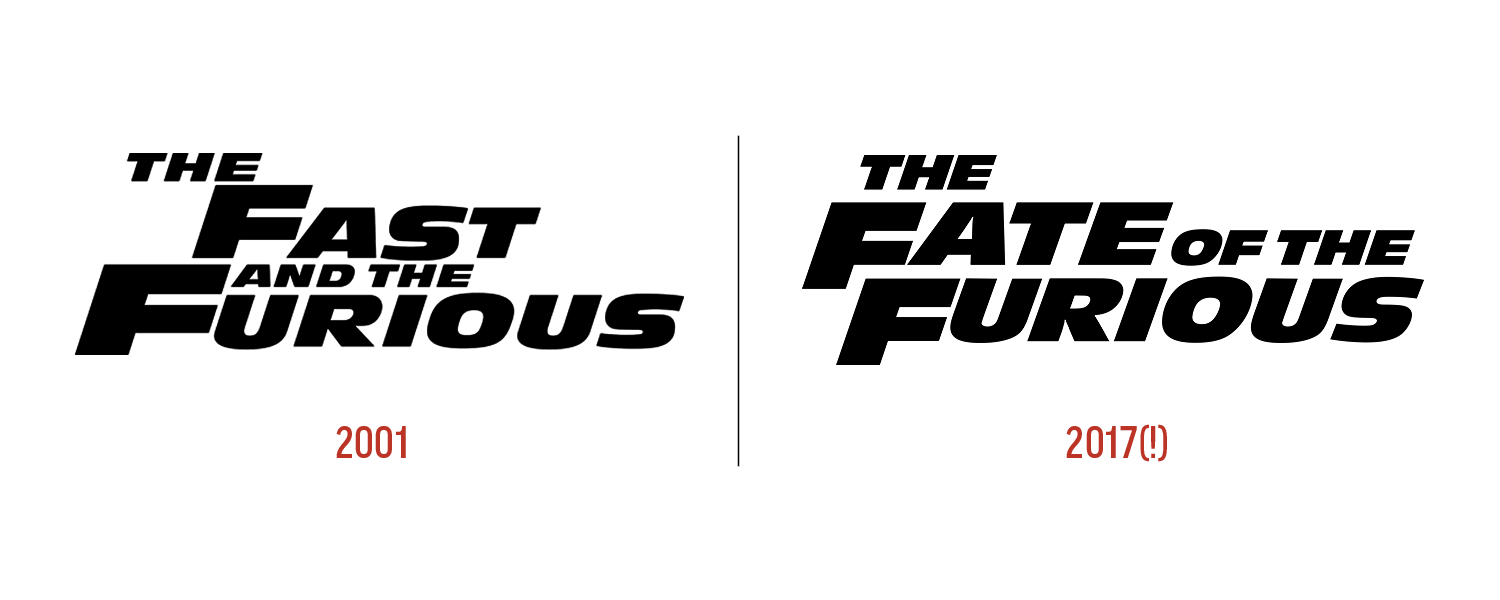
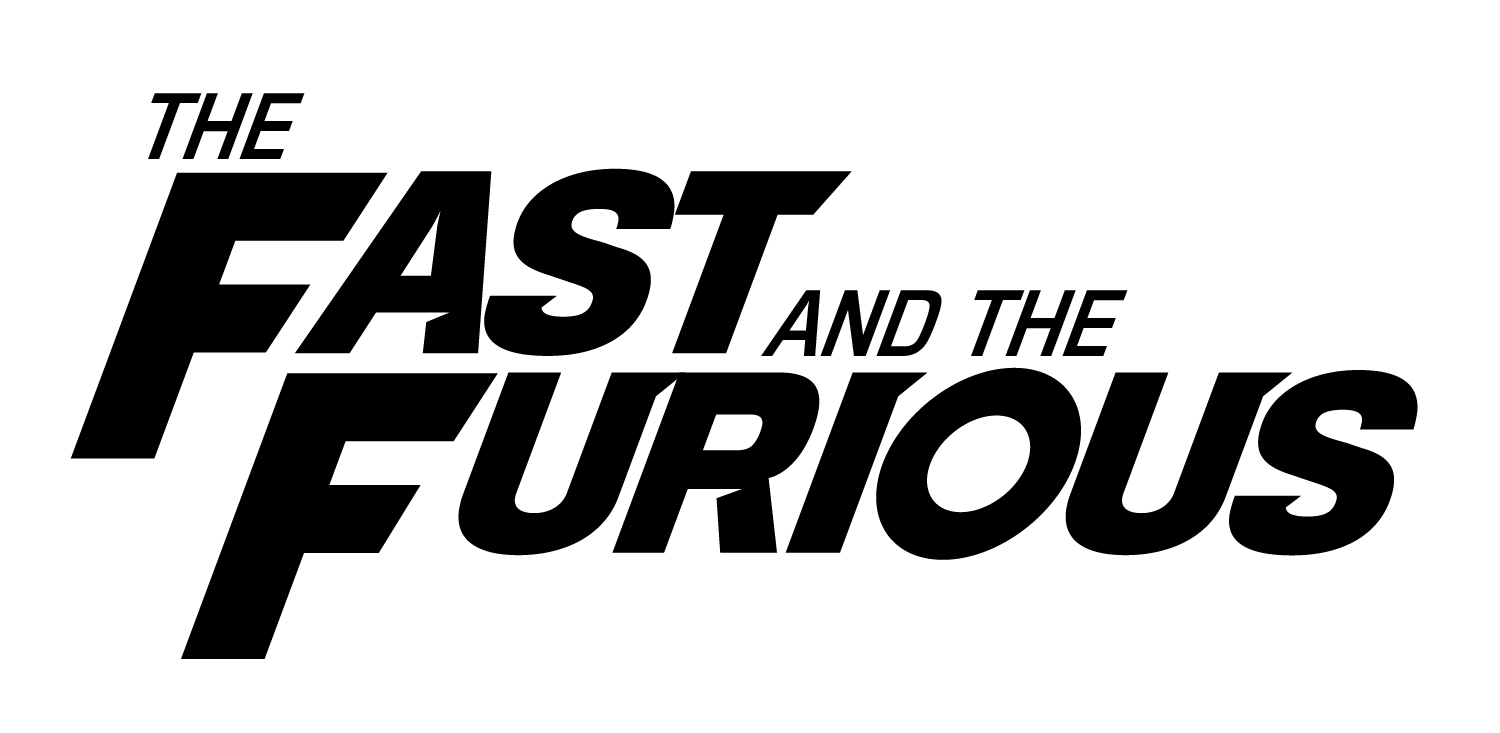
The Fast and Furious franchise has done a lot to admire. It went from a niche movie about two guys who like cars and measure their life in distance (and FAMILY, DAMMIT) to a full blown box-office dominating action franchise that might be the platonic ideal of what The Expendables tried to be.
It slowly but surely leaned into the best parts of its formula and successfully created something enormous out of relatively nothing. It’s excellent brand management…
Except for the typography.
Looks like an antique olive might taste.
If I had to guess (and I do), I’d say the studio released the first film and didn’t pay a ton of mind to the typography of the title, the series’ de facto logo, thinking not much would come of it and they’d make a quick buck.
37 [citation needed] films later, why are they still using Antique Olive? It’s only a few degrees away from Impact, the prototypical meme font. Is it just too late to change it? This is one of the biggest action film franchises in the world, not a tchotchke shop sale at the beach.
I took a shot at a solution.
Starting with a more grown-up font that maintains the burly nature of… well… everything in the films, I went with Titling Gothic. Not too far from Antique Olive. I also used both bold and roman weights help us focus on “Fast” and “Furious.” From there, we tilt forward to suggest speed and I added some angles to the letterforms for extra movement and dynamics. Spacing remains largely consistent to maintain tension, and we follow the (very smart) choice to align the small caps more or less with the top of the x-height.
This isn’t completely polished (the added angles could all be the same pitch and the kerning could use more attention), but it’s solid start to a more thoughtful evolution of the logo (I’m well aware that “thoughtful” isn’t exactly a theme in the series).
The first spinoff, Fast & Furious Presents: Sentient Charisma, has a trailer out. Looks awesome, except for one thing…
PS: This franchise can name a damn sequel. Kudos to them for having fun.


