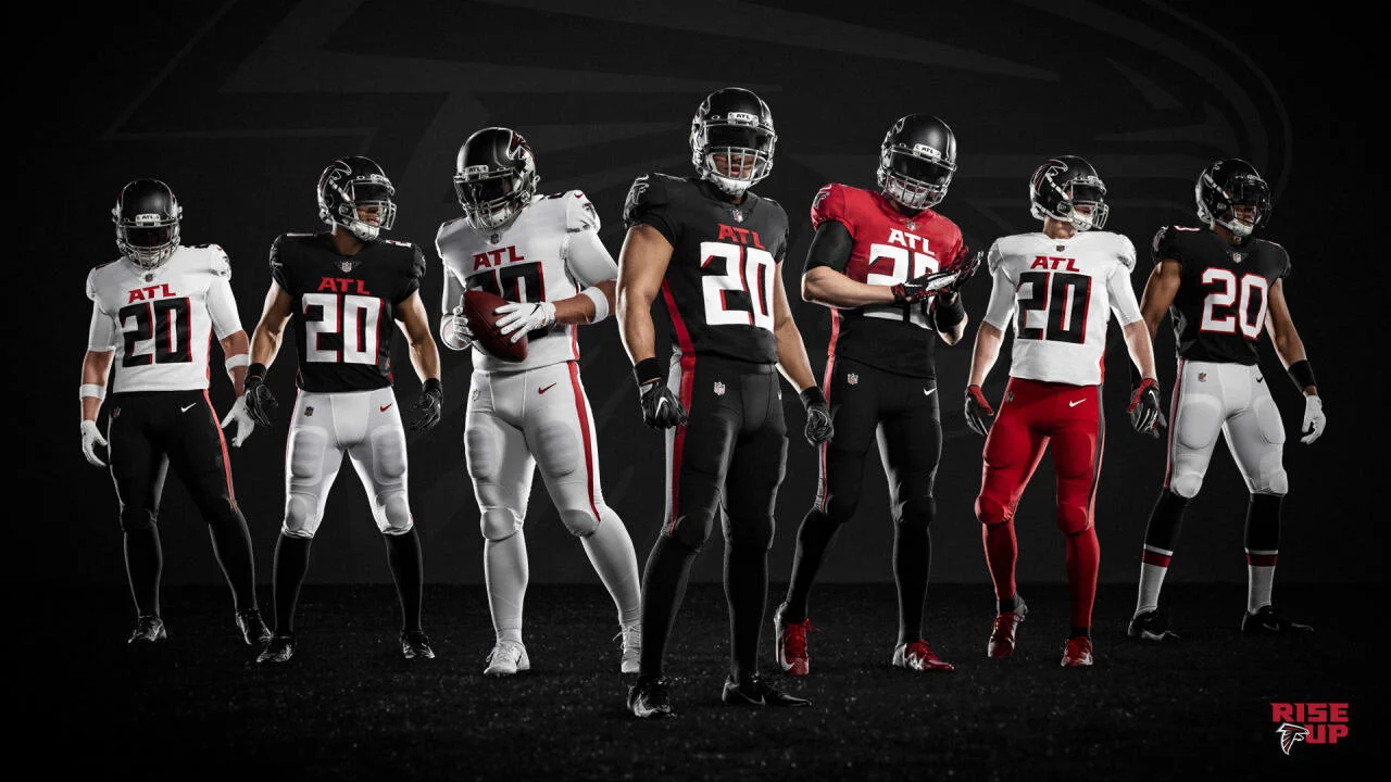
There were more high-profile NFL logo and uniform changes this offseason than ever. Or maybe it just really seems like it. Pro sports rebrands are a huge deal. They can turn the fortunes of multi-billion dollar franchises (hellooooooo 1997 Tampa Bay Bucs) and signify a new era (Bill Parcells-era Jets). So what did we learn (or get reminded) about the NFL in terms of uniforms and change this season?
Nike Is Fleeting
Three of the seven uniform updates this offseason were a back-to-basics exercise that occurred the second their 5-year uniform rule expired. The Bucs, Browns, and Chargers all made their layups, to near universal acclaim. In each case, the move was a refutation of the Nike aesthetic. No more big splashy nameplates. Infinitely less paneling.
The Bucs woke up and got rid of the alarm clock numbers, basically returning to their championship-era unis while keeping the updated logo. The Browns returned to their stripe-heavy aesthetic, which is more indicative of their brand than any other team because they have blank helmets (quick aside, it’s way better when their TV graphic is either an orange oval or some version of the orange, brown, and white stipe pattern than just slapping a helmet up there). The Chargers simplified their color scheme and the application of the bolts on their unis.
Meanwhile, the Falcons thought it was a good idea to use gradient jerseys and pajama suits.
What has gotten a better foothold are color rush-type matching jersey and pants combos. Who knows how often teams will actually use those, but to us it’s obvious which combos stand out the most.
It’s the ones with contrast. (atlantafalcons.com)
NFL Uniform Success Is A Relatively NARROW Lane
The NFL has been around for a long time. If memory serves, last year marked 100,000 seasons. In that time, the league has reached roughly eleventy billion trillion sets of eyeballs. With that much time, you’re going to find things that just… work. And with that much exposure, those things are going to become standards.
NFL uniforms that utilize classic sleeve stripes, vertical pants stripes, TV numbers, and so on aren’t boring or unimaginative. They’re proven. They signify NFL standards (look at us shilling for The Shield). That’s why you see people saying the Falcons look like an Arena League team.
The NFL is confidence. Have confidence in what works. Teams should focus on their logo and helmet primarily.
It’s not bad or wrong to push established norms (it can function as a reminder of what works, ask the Bucs or Browns), but sometimes you go too far and have to take 3 steps back just to take the one step forward you should have taken to begin with.
Less Is Still More
My favorite updates are those that you wouldn’t necessarily notice, perhaps born out of necessity. The Chargers hit this out of the park. Look how tight this logo is compared to the previous version.
Sure, the old version has that charming, kinda naïve awkwardness that you can look past as a product of its time, but it falls apart on closer inspection. The new version is modernized onto a grid without being sterile and makes improvements you didn’t know it needed, like simplifying its outline stack. Huge props to the design team on this. The craftsmanship is stellar (lightning bolts are deceptively tricky to do well).
The Chargers took a simple approach. They didn’t do a lot, and in doing so did so much. The Bucs and Browns did too. They went back to what’s proven to be effective, and worked within that lane to make it their own.
Less is STILL More
The Rams made sure we knew where every single design element came from (except, somehow, for the squiggle of yarn on the jersey patch), but inspiration can only go so far. The horn alone “mimics the spiral of a football and the crest of a wave in the ocean,” while also fitting into the golden ratio (it doesn’t). The Colts added black to their color scheme to “represent the hard work and resolve of our team and our fans.” It’s only used for the sponsor logo.
Good design doesn’t necessarily need these things. They’re nice to have, but these were forced and likely retrofitted. All the inspiration in the world won’t save a bad foundation. Which leads us to…
Strong Foundations Are Important
The mark the Rams based everything they’ve done this offseason on is… mediocre. When it leaked, the team said specifically that the final design had gradients, which implied how important they were to the final composition, but gradients shouldn’t be they key to making a major sports logo work. They should be window dressing. So when the uniforms came out, there the logo was, un-gradiented, its averageness laid bare for all, on the helmet. On. The. HELMET. The most important piece of real estate on any football uniform.
Now, we wanted to give them the benefit of the doubt. Maybe the redesign came about because the old horn no longer fit properly on modern helmets. Perhaps the new horn fits better, (not entirely), but maybe just tweak it like the Chargers did.
Additionally, while the “bone” color doesn’t read “practice squad” as much as expected, the added yellow accents don’t provide enough contrast or reason for being on the uniforms at all. That’s rather ironic considering how much they shoehorned in explanations for everything else. The other question this brings up is who are these uniforms for? Viewers and fans to ID the team, or players on the field to really appreciate the finer details.
Honestly, I could talk about what the Rams did until they undo it in 5 years.


